01
We learn your business first.
What you do, your customer base, and what makes you different. That decides the structure — not the other way around.
No templates. No tech stress. No copy-paste design. Just clear Flipp'd blueprints shaped around real businesses.
What you do, your customer base, and what makes you different. That decides the structure — not the other way around.
A service business needs clarity and trust. A product business needs focus and flow. We pick the right starting point for your business.
Colours, copy, photos, tone — everything is tailored. The structure is the starting line. The finished site is unmistakably yours.
Start with a proven structure, then move everything that needs moving: layout, colour, imagery, copy, calls-to-action, proof, and brand mark. Tell us what you like, or let Flipp'd choose the route that fits.
The blueprints below are starting points, not limits. We use them to choose a direction, then reshape the layout, colour, copy and calls-to-action around the business.
Each one solves a different business problem. The final build can borrow, blend, simplify or completely reshape these directions around your brand.
Headline and a clear ask on the left, a strong image on the right, services in a row beneath. Built so the next step is obvious in two seconds.
A tall feature image holds one side while the story and a finished-work strip sit beside it. Calm, considered and quietly refined.
One immersive, low-lit image fills the screen with a centred line over it. The site itself feels like walking in the door.
A warm full-width photo with a calm booking card floating over it, and three plain-English service cards underneath. Confidence without the noise.
A mouth-watering hero, then the three things a local actually needs: hours, location and what's on. No scrolling to find the basics.
A bold headline leads the image, backed by a clean row of proof points. Direct, energetic and hard to miss.
A search bar sits right on the hero so visitors start filtering immediately, then results fan out as tidy cards. Built for businesses with plenty to organise.
A measured intro, three labelled solution blocks and a row of proof points. Reads as organised, capable and ready to trust with the job.
A fixed nav rail anchors one side while a grid of finished shots does the talking. Feels like a boutique catalogue, not a website.
A cinematic hero with the line set low, quick service pills to self-select, and a strip of recent jobs along the bottom. Polished, but easy to navigate.
Acres of calm space, one thing dead-centre, and a single line that lets it speak. Two quiet links, nothing fighting for attention. Restraint as confidence.
A full-bleed hero with a bold lower-left headline and one strong call to action, then a rail of products lined up with purpose. Built with pace, built to guide action.
Each of these started as a one-line brief for a different kind of business, then became a full direction across trades, cafes, salons, gyms, hospitality, retail and local services.
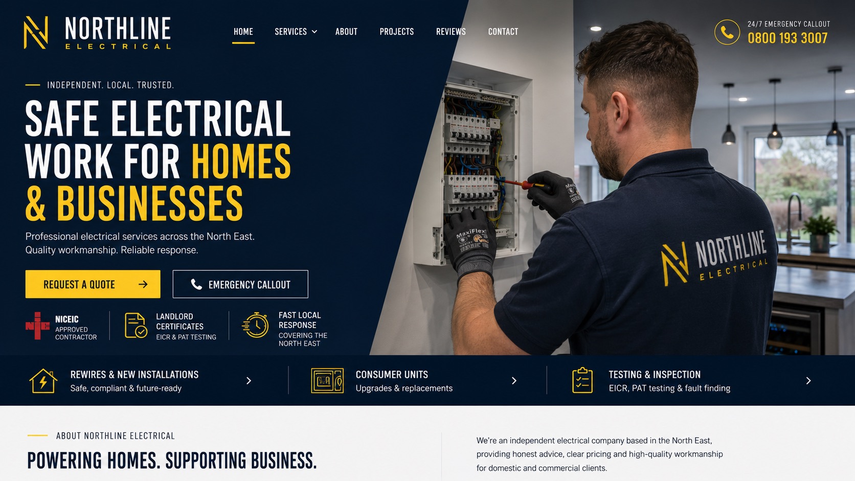
The idea: an emergency electrician that looks NICEIC-approved before you even call.
Use this direction →Flipp'd designs your mark around the business behind it, not a shape that could belong to anyone. It carries across your website, socials and signage, so customers know it's you at a glance.
One business, one identity. Not generic, not borrowed. Flipp'd shapes the mark around your business, your tone and your customers, then carries it through your site and socials so the first impression is finally, unmistakably yours.
Make the logo mine →You see choices that sound like strategy: the feeling, the goal and the reason each route could work for your business, whatever trade you're in.
Warm, familiar and community-led. Best when the business wins through personality, regulars and word of mouth.
Fast, practical and action-led. Best when customers just need menu, services, availability, location or a clear enquiry path.
More spacious, visual and brand-led. Best when the business wants to feel polished, boutique or higher value.
Most small businesses do not need 2,000 layouts. They need someone with taste to decide what matters, write the page clearly, design the mark, and make the final site feel like them.
Website, socials, logo, photos, or just the business name. Flipp'd turns your ideas into a brand that's ready to be seen. You run the business; we'll handle the design.
Get Flipp'd →